Like everyone else, I love the new Google Maps iOS app. As an ex-Android user, I’m well aware of how much better the maps offering is (and has been for years) on Google’s OS. There have been numerous posts on the Google Maps iOS app so I won’t go into the bigger reasons why this is the must-have maps app for any iPhone user, instead I wanted to focus on three small UX features that you may have missed.
The translucent status bar
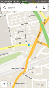
Now I don’t know how easy this is to implement, but I can’t recall seeing it on any other apps so thought it was worth calling out: as you can see in the screenshot above, the status bar above the Google search bar is translucent, showing the map scrolling behind it. Usually the status bar is an opaque black bar. The same on every app. Not only is this something different for the Google Maps app and looks nice, but also adds those extra few pixels that can help to orientate you when trying to find where you are on an unfamiliar map.
Two-finger swipe
Swipe from right to left, with two fingers and the side nav slides out. I don’t know why more developers don’t implement multi touch gestures in their app experiences when both gestures and multi-touch are so engrained in the mac’s experience. Anyway, this is a nice interaction that shows the level of UX polish that Google added to this app.
‘Home’ & ‘Work’

Clicking on the ‘account’ icon on the right of the search bar opens the account panel, showing, most notably, your starred places. Here, you have the option to add a location for both ‘home’ and ‘work’, meaning you are never more than a couple of taps away from orientating yourself with a familiar map. ‘Home’ and ‘work’ are also handy when navigating, as the app will recognise the keywords ‘work’ and ‘home’ when searching for places.
In the unlikely event that you haven’t already, I recommend switching to Google Maps immediately. Not only is it a much more accurate solution than Apple Maps, the fact that it is a Google-controlled app as opposed to the Apple-controlled Google maps iOS’ past will almost certainly mean a regularly improved, iterated upon, and updated solution.
